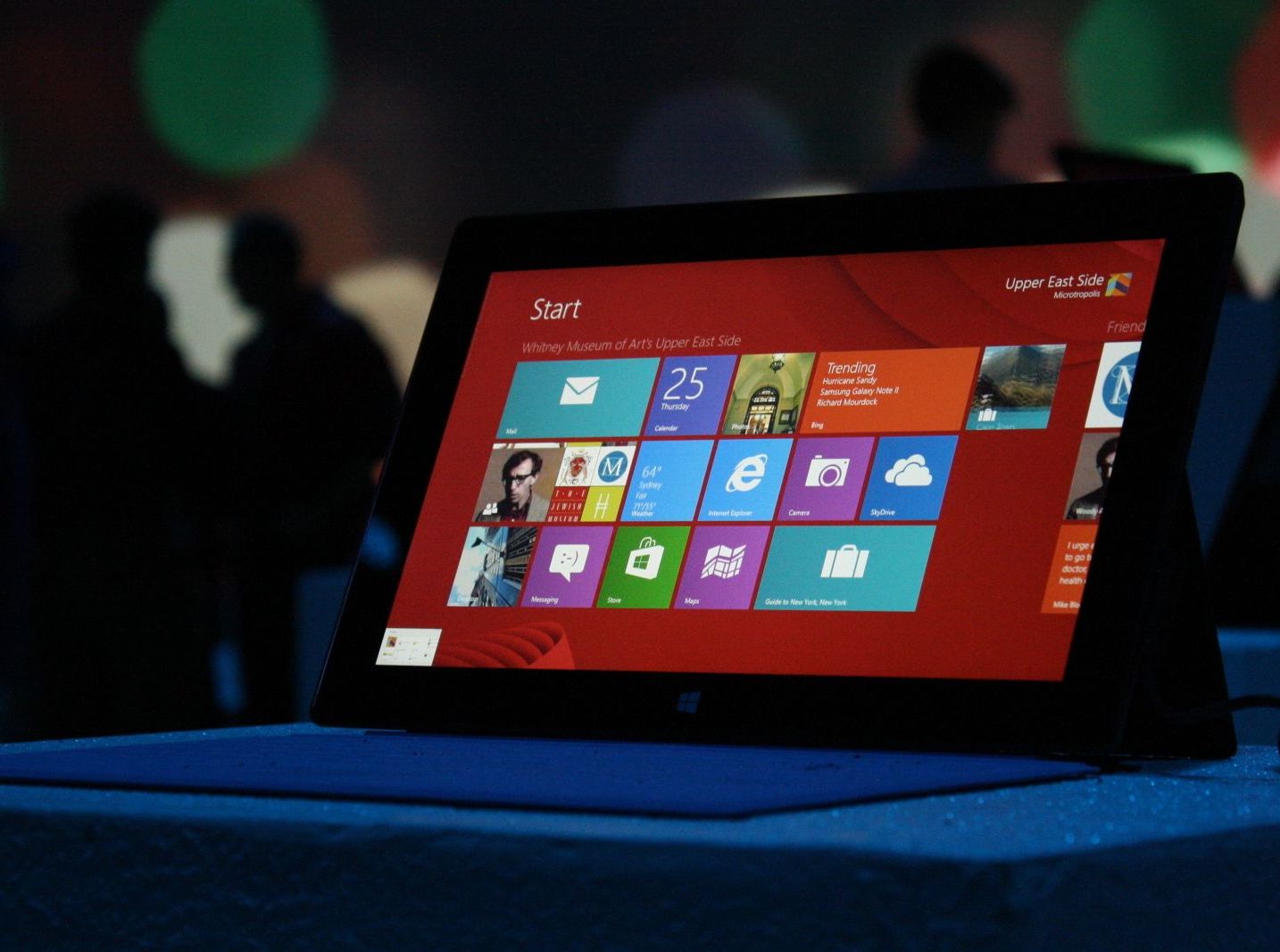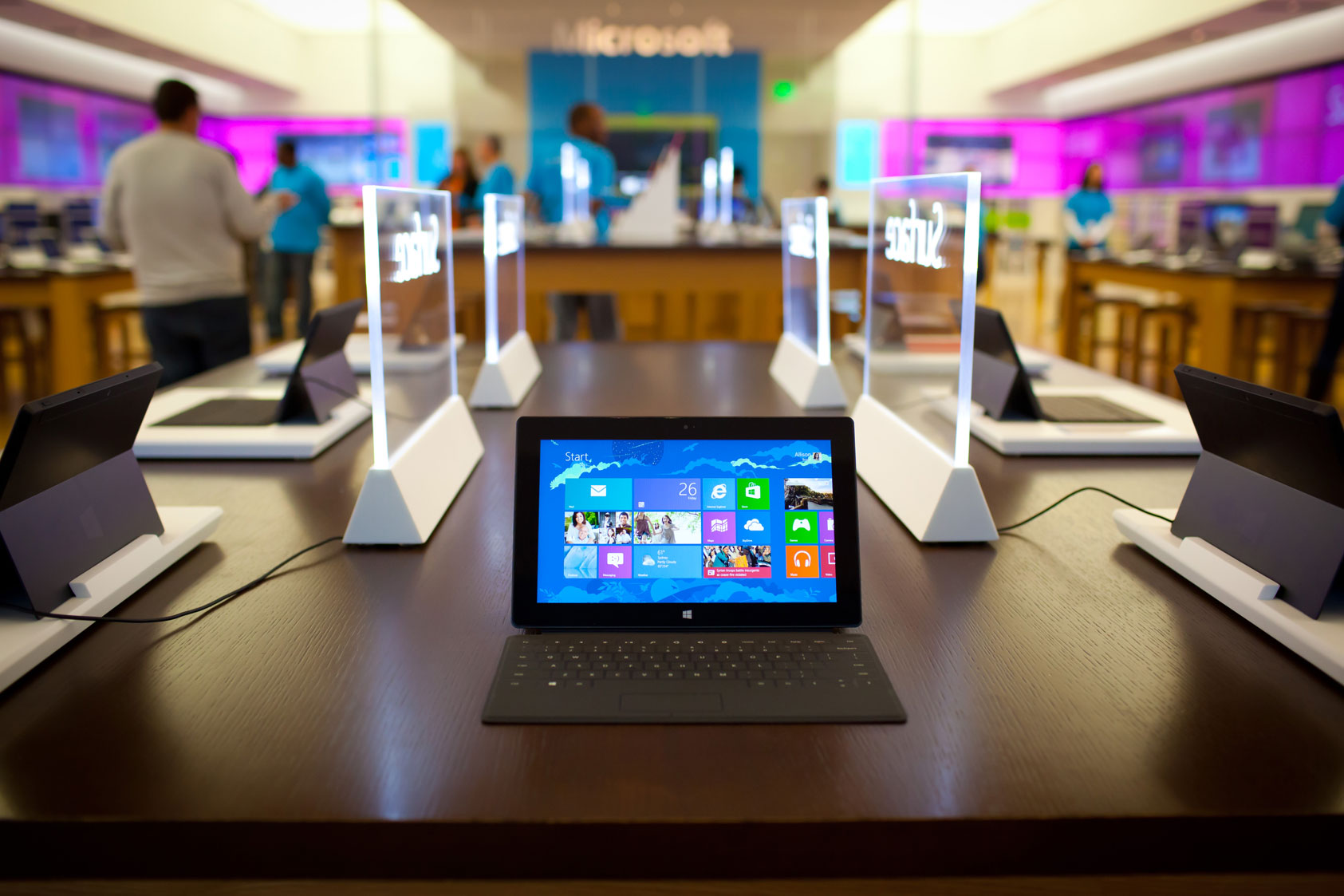
When Microsoft first debuted their new and improved touch interface—which was originally known as Metro—for Windows 8, people flipped, and not in the good way. Windows 8 was different, really different. This was Microsoft’s volley to hoist their device converging software upon the masses, attempting to bridge the gap between tablet and desktop environments.
There is no doubt that things went awry very early-on as information started to leak about the new operating system, with hardcore user’s non-acceptance, and novice user’s shock and confusion. Even before Windows 8 actually reached the hands of its consumers, things weren’t looking good for the guys over in Redmond. Initially this angst seemed more of a clear revolt against change to a touch-first focus, rather than truly bad design. But uneasiness grew even stronger as Microsoft rolled out betas of the new operating system and the worst fears of early adopters were realized.
In the wake of said fears, it has taken Windows 8 quite some time to penetrate the market, as most corporations have stuck with the now rock-solid Windows 7 or the now un-supported Windows XP. All the while everyday-consumer trends have been moving toward the now popular tablet solutions for most computing needs. Weather it be Apple’s iPad or the smattering of Android tablets, the writing seems to be on the wall for the desktop computer, at least in the minds of the average mainstream user.
Now that we are well over a year and a half into Windows 8 being prevalent in the computing retail atmosphere, I have begun to see more and more people using the new operating system, and it hasn’t been pretty. In the cases where I’ve played tech-support, attempts to educate would-be adopters have ended with them either going completely back to Windows 7, or using third-party tools to alleviate the pain to use something so vastly different. Power and novice users alike have been universally on the same page about their opinion of Windows 8, they don’t want the Modern user-interface.
As I’ve stated before, implementing a tablet interface into their mainstay product seemed to be a reasonable move for Microsoft, but a major miscalculation in the mainstream acceptance of a half-tablet half-desktop amalgamation of software would leave customers in dismay, and Microsoft scrambling for a solution. Simply put, Microsoft should not have forced Metro/Modern UI on their users. From the company’s perspective, this was a brilliant move, and I can agree with their position except for one glaring fact, people hate Metro. Or at least they hate what Metro originally was and stood for.
Of course my advice to some of thinking of Metro as a glorified Start Screen should be enough in most cases, but I can’t be blind to the fact that Windows 8, as it originally shipped, required a new way of thinking. And we all know what happens when a user is presented with even the slightest change in the way an application’s user-interface works right? Just ask Facebook.

Many steps have been taken to alleviate the pain of the new UI. With Windows 8.1, which came out nearly a year after Windows 8 as a freely available upgrade, Microsoft added much needed user-interface and desktop changes that made things a bit more tolerable for the legacy user like: booting directly to desktop, an all apps view on the Start Screen, and an actual Start Button among other things.
- The Start Button Returns
- Boot to Desktop
- More Lock screen and Start Screen Options
- Refreshed Xbox Music
- Better Search
- Better Multi-Monitor Support
- Windows Store Improvements
- More Extensive OneDrive Integration
- More Comprehensive Metro Control Panel
- 3D-Printing Support
Even with these changes, most people didn’t feel Microsoft went far enough. So this year Microsoft dropped Windows 8.1 Update, which can mostly be seen as a service pack. This update provided additional improvements to, again, move things more inline with the Windows of times past. Improvements in this update included: a more prominent power button, the ability see open Metro applications on the taskbar for desktop users, and the ability to x-close Metro applications for desktop users, among many more features geared toward traditional desktop users.
- Modern App Title Bar
- Start: Search
- Start: Power button
- Start and Apps: Context menu
These changes have been welcomed. And with the induction of a new CEO, Satya Nadella, Microsoft has moved to a cadence of rapid release that will hopefully make for a better Windows for both the desktop and tablet users alike, ultimately fostering a more palatable experience and improve adoption. What was originally a usability problem has now become more-less a perception problem. Most of the glaring issues that would have keep someone away have been addressed in its current iteration, making for a less-jarring, more familiar experience.
Some changes are easier to handle than others. Windows 8 was a huge change. Was it the right move? Who knows, but one things is clear. When your company is as vast as Microsoft is, and your piece of software is so entrenched in the DNA of the computing industry, any change is going to be a huge thing. Should a tablet-centric operating system be separate from a traditional desktop system? Probably, but what’s done is done. Let’s just hope Microsoft continues to steer this humongous ship in the right direction. Here’s for veering away from that iceberg.
Sources: ExtremeTech, WinSuperSite